Letterform Unity - "Joy" (#2)
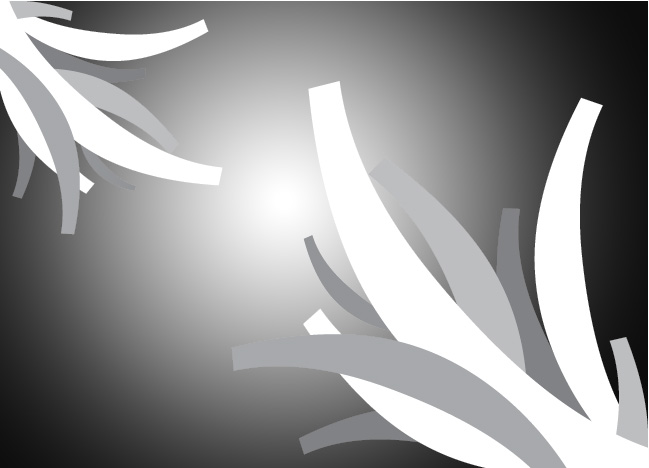
As I had time and more ideas, this was my second attempt at using letterforms to create the feeling of "joy."
I wanted to see if it was possible to represent joy with a different font that didn't have that flowing feeling the same way Zapfino did. These forms are mostly parentheses, but I thought it looked like they were reaching out to each other or growing towards each other, so still a kind of spring feeling.
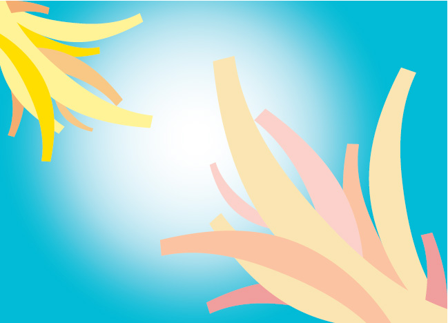
For my first color set with this particular attempt, I wanted to make it seem like the larger group was growing towards the smaller group. Having a solid blue background didn't look as impactful as this final version with the circular gradient point. I also wanted the smaller group to be more colorful because it would come across as the bigger group trying to become the same as the smaller group and giving a feeling that if they just reached each other, everything would be great.
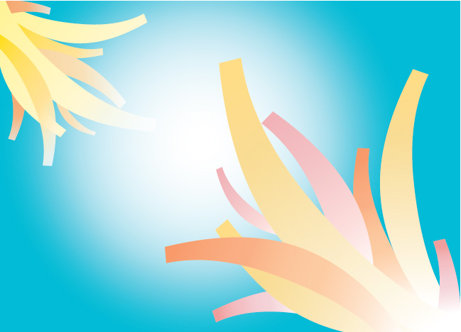
This color attempt, on the other hand, I wanted to see how pushing different gradients different ways would look. I thought it came out rather nicely and you could still feel joy emanating from the design.
