"Directional" Poster - Angolphile #1
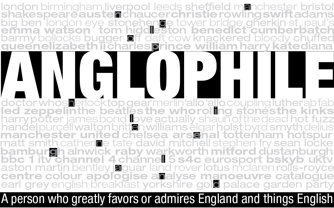
This was a project that would "map" out something about us. I went with the fact that I'm kind of an Anglophile.
Because I'm an Anglophile, I felt that meant sharing the things that I like about England and the UK. Each line of text is a list of different aspects I enjoy. Actors, places, television shows, even spelling of words.
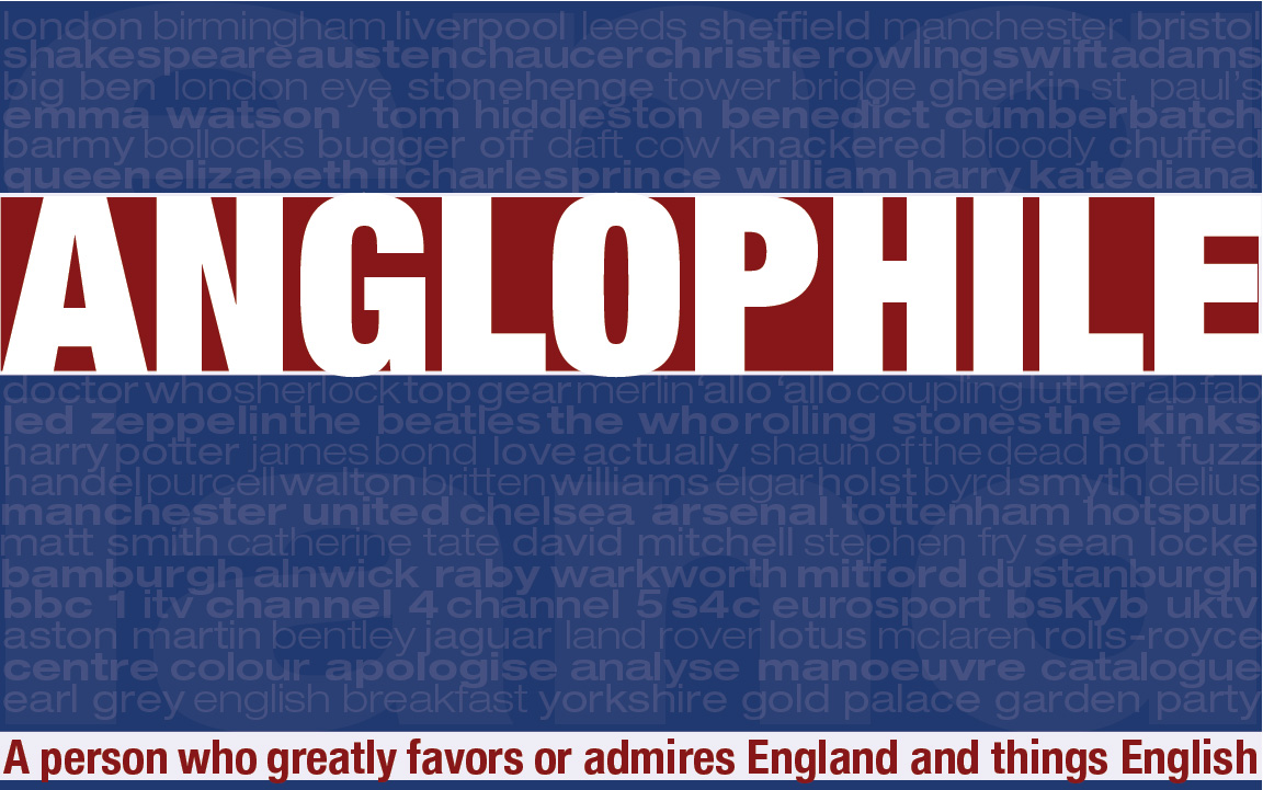
This is the first color version I made. I went with this color scheme to represent the flag for the United Kingdom. The rows of text are the more prominent aspect of the design after the main word, "Anglophile," and the definition of the word.
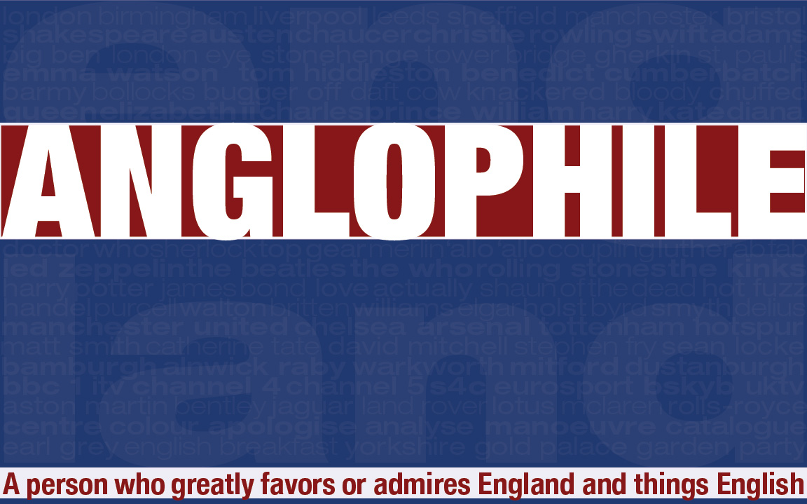
This color version kept the same color scheme, but I emphasized the "England" in the background instead of the rows of text, making those a tertiary aspect of the design.
