Typographical Lyric Interpretation - "Africa"
The first project for my Typography class was to make a typographical interpretation of a set of lyrics of our choice. I chose the ever classic "Africa" by Toto.
When this project was assigned, the only song that was in my head was "Africa" as I had been listening to it right before I walked into class. This was perfectly fine with me as I was excited to design the lyrics in a way that made you see the feeling of the song due to the visualizations.
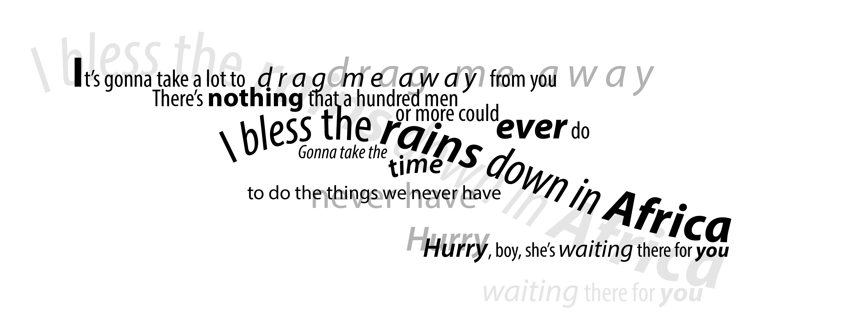
I really wanted the "drag me away" to look like it was being dragged away from something, but with effort. That's also why it's echoed in the background and after "from you." I also wanted to emphasize "nothing" and "ever" as they're obviously some of the most important parts of that particular line.
"I bless the rains down in Africa" was begging to be on a line that curved downward, with "rains" and "Africa" in a bolder version of the font due to how they're sung in the song. The same was true of the word "time." While the "Hurry, boy..." line is sung after a few other lyrics and is slightly separate from this part of the song, I thought it fit really well with the interpretation so far.
To help illustrate the more meaningful aspects of the lyrics, I echoed them in the background, bigger than the original, but with the same effects.
"I bless the rains down in Africa" is the most famous and important line of the whole song, so that's why it's emphasized in the echo more than anything else. It's the defining moment of the song.
This is another project where I was extremely satisfied with the outcome. It was also a lot of fun to create.


