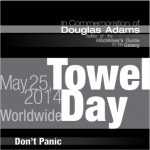
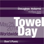
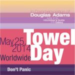
- Promote an event using typography displaying visual hierarchy, black & white
- Promote an event using typography displaying visual hierarchy, green scheme
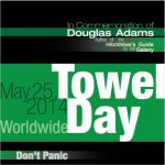
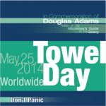
- Promote an event using typography displaying visual hierarchy, cool tones scheme
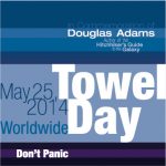
- Promote an event using typography displaying visual hierarchy, purple scheme
- Promote an event using typography displaying visual hierarchy, pink scheme
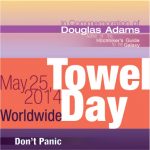
- Promote an event using typography displaying visual hierarchy, orange sunset scheme
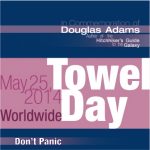
- Promote an event using typography displaying visual hierarchy, blue scheme
- Promote an event using typography displaying visual hierarchy, pink sunset scheme
Visual Hierarchy Event Ad
This project had us create what would basically be an ad for some event coming up but only using text. The different styles of text is what gives different parts of the ad different levels of importance and guide the reader to what should be read first and thereafter.
My advertisement is for what has lovingly become known as "Towel Day." A memorial day for the author of the Hitchhiker's Guide to the Galaxy books, Douglas Adams. In the books, it is advised that one should always carry a towel with them, so on May 25th, fans of his work carry towels, much like we were informed to do by Ford Prefect.
I wanted to make sure the "Towel Day" was the most important and first read part of the design. It would grab the attention of the reader and they would wonder what exactly that meant. Their eye would then be carried to the date, then up to the top which explained what exactly Towel Day was. Then, on the bottom, a callback to the most important phrase of the books, "Don't Panic."
I tried a few different color versions. The original was green and black, as there used to be an old Apple command prompt game that accompanied the books, and I thought that would be a nice callback. The other colors were just experiments to see how they would look and to see how my classmates and professor would feel about them.
